Key Takeaways
- Provide a Clear Value Proposition: Make it easy for visitors to quickly understand why your page matters to them.
- Guide Users Seamlessly: Ensure every element of your page works together to lead visitors naturally toward taking action.
- Minimize Distractions: Keep your landing page clean and focused so users stay engaged and are more likely to convert.
Every visit to your website is an opportunity to engage, persuade, and convert. But without website design that converts, even the most compelling offers get lost in a sea of digital noise.
A Google research shows users form an opinion about a website in just 50 milliseconds. In that blink of an eye, poor design choices can undermine trust and kill conversions.
Whether you’re marketing software, professional services, or e-commerce products, a carefully crafted user experience can transform passive visitors into qualified leads. Here are six evidence-based design elements that high-performing websites use to drive results.
“Did you know your website’s design is also a powerful SEO tool? Read Web Design Is Your Best SEO Weapon”.
1. A Crystal-Clear Value Proposition
Your homepage’s headline is your first and often only chance to capture attention. Web visitors often spend under a minute on a page, during which their gaze jumps around 72 times, reading just about 20% of total content. A concise, benefit-driven headline helps ensure they don’t bounce.
Your value proposition should answer:
- What are you offering?
- Who is it for?
- Why does it matter right now?
Good Example: “Get More 5-Star Reviews Automatically” (for a reputation management tool)
Weak Example: “Empowering Growth Through Digital Synergy” (unclear and jargon-heavy)
“Clarity trumps cleverness in web copy,” says DaBina Heng, CEO of Techna Digital Marketing, a leading Vancouver, WA website design agency. “If a visitor can’t tell in five seconds what you do and why they should care, they’ll leave.”
Pro tip: Support your headline with social proof: client logos, industry awards, or a quick testimonial snippet can immediately boost credibility.
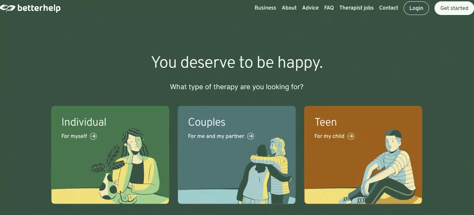
Real-world Example: BetterHelp
Homepage headline:
“You deserve to be happy.”
This simple, empathetic phrase communicates:
- What they’re offering: Online therapy with licensed, professional therapists (“Professional Therapy With A Licensed Therapist” subhead)
- Who it’s for: Anyone struggling with mental health—depression, anxiety, relationships, trauma, grief—seeking support they deserve
- Why it matters now: Positioned with urgency—“when you need it”—highlighting convenience and accessibility
Key Insight: A clear and concise value proposition establishes immediate relevance and helps build trust, setting the tone for the rest of the user experience.
Once you’ve established clarity, the next step is to support it visually to draw users in emotionally.
2. A Hero Visual That Sells the Outcome
That top-of-page image or video—known as the “hero”—does more than set the aesthetic tone. Recent research confirms that users form trust perceptions based heavily on visual design alone—factors like layout, typography, and image quality. In controlled experiments, participants consistently rated professionally designed websites as more credible and trustworthy than poorly designed ones.
To maximize impact:
- Use authentic imagery or product demos, not generic stock photos.
- Show your offer in action (e.g., a SaaS dashboard animation).
- Evoke emotions tied to the outcome your product delivers.
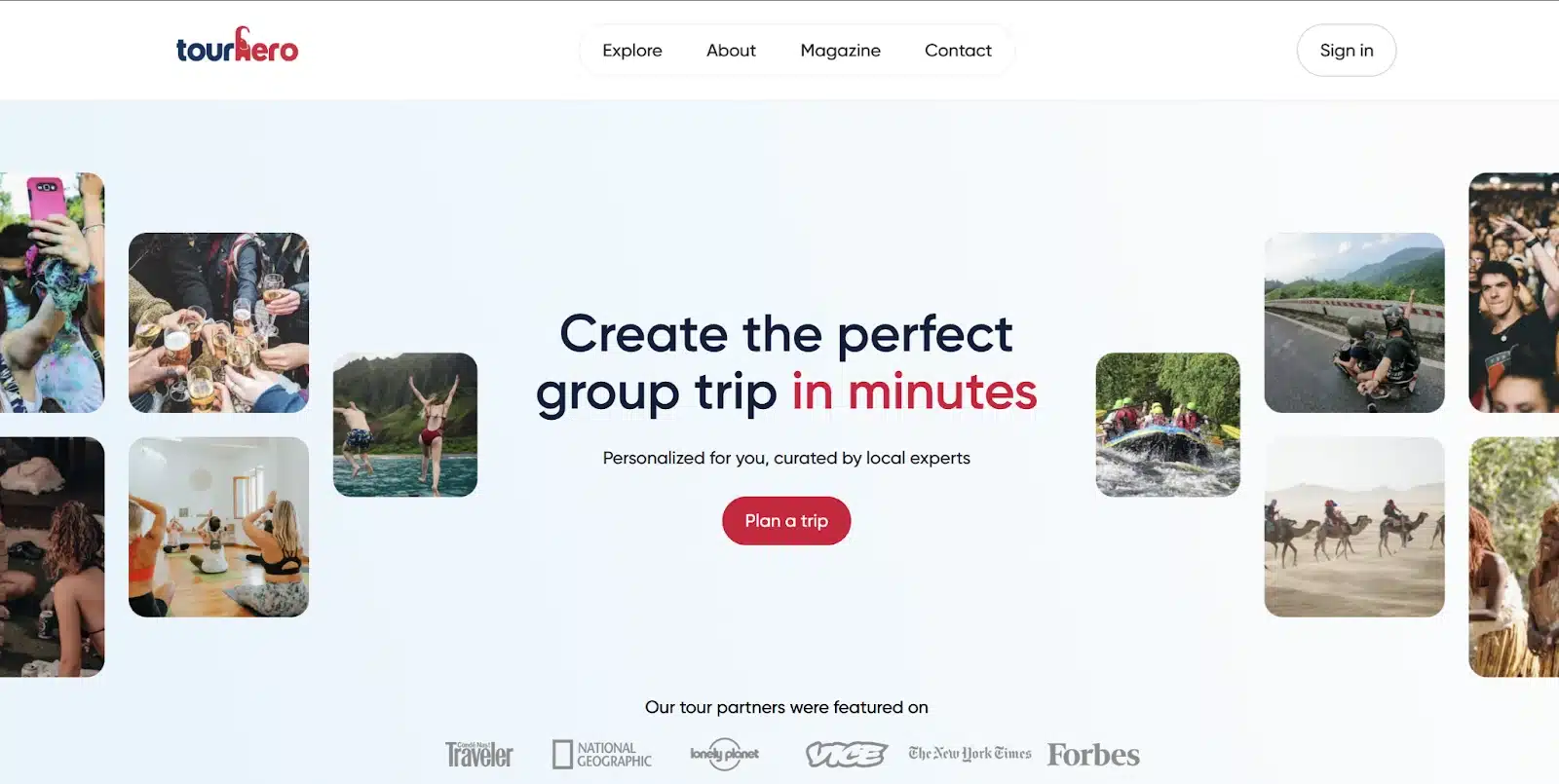
Real-world Example: TourHero
Homepage headline:
“Create the perfect group trip in minutes”
This outcome-focused, benefit-driven headline communicates:
- What they’re offering: A fast and easy way to plan group trips, personalized for you and curated by local experts.
- Who it’s for: Travelers organizing group adventures—friends, families, or like‑minded explorers seeking unique experiences.
- Why it matters now: Emphasizes speed and personalization, addressing common pain points of group trip planning.
The subheadline reinforces the value:
“Personalized for you, curated by local experts”
—building trust and highlighting authentic, tailored experiences.
Social proof:
A band of credibility is added with:
“Our tour partners were featured on [media logos]”
which instantly reassures visitors they’re choosing a trusted platform.
Key Insight: A compelling hero visual works in tandem with a strong headline to engage visitors emotionally and visually reinforce your value proposition.
With attention captured visually, you can now focus on making interaction effortless for your visitors.
3. Streamlined, User-Friendly Lead Capture Forms
The moment a visitor decides to engage, don’t scare them off with a bloated form. Reducing the number of form fields from 4 to 3 can increase conversions by up to 50%.
Design best practices:
- Request only essential information (name and email often suffice).
- Optimize for mobile with responsive fields and large touch targets.
- Consider progressive profiling: ask for more details later as trust builds.
Multi-step forms can also perform better than single-page forms for complex offers. Breaking the process into smaller steps reduces psychological friction.
This approach aligns with the LIFT Model® by Chris Goward, which highlights how clarity and reduced distractions drive conversions while minimizing anxiety.
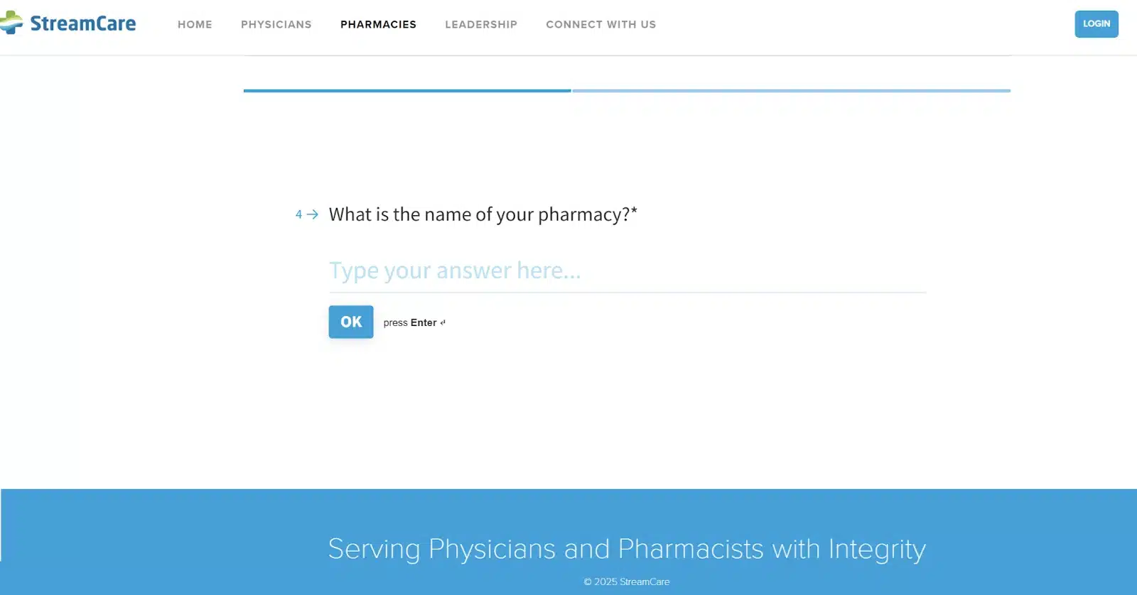
Real-world Example: StreamCare
Why this works:
A lead capture form that incorporates the following elements:
- Minimal fields—asks only essential info to kick off the onboarding process.
- Mobile-optimized and visually consistent with StreamCare’s branding.
- Multi-step logic guides pharmacies through tailored questions, reducing friction and boosting completion rates
Key Insight: Simplicity and responsiveness in lead capture forms reduce friction, keeping visitors engaged and increasing the likelihood of conversion.
After making engagement seamless, it’s critical to prompt visitors with the right calls-to-action to convert their interest into results.
4. Calls-to-Action That Demand Attention
Your CTA isn’t just a button—it’s the conversion trigger.
High-performing CTAs share three traits:
- Contrast: Use colors that stand out from the rest of the page.
- Placement: Position CTAs above the fold and at natural stopping points.
- Copywriting: Make it benefit-focused and actionable.
Better CTAs:
- “Start My Free Trial”
- “Send Me the Report”
- “Claim My Discount”
Weak CTA:
- “Submit”
A/B testing CTA text alone can yield surprising results. Unbounce reported a 90% improvement in conversions after changing a button label from “Get Your Free 30-day trial” to “Get My Free 30-day trial”.
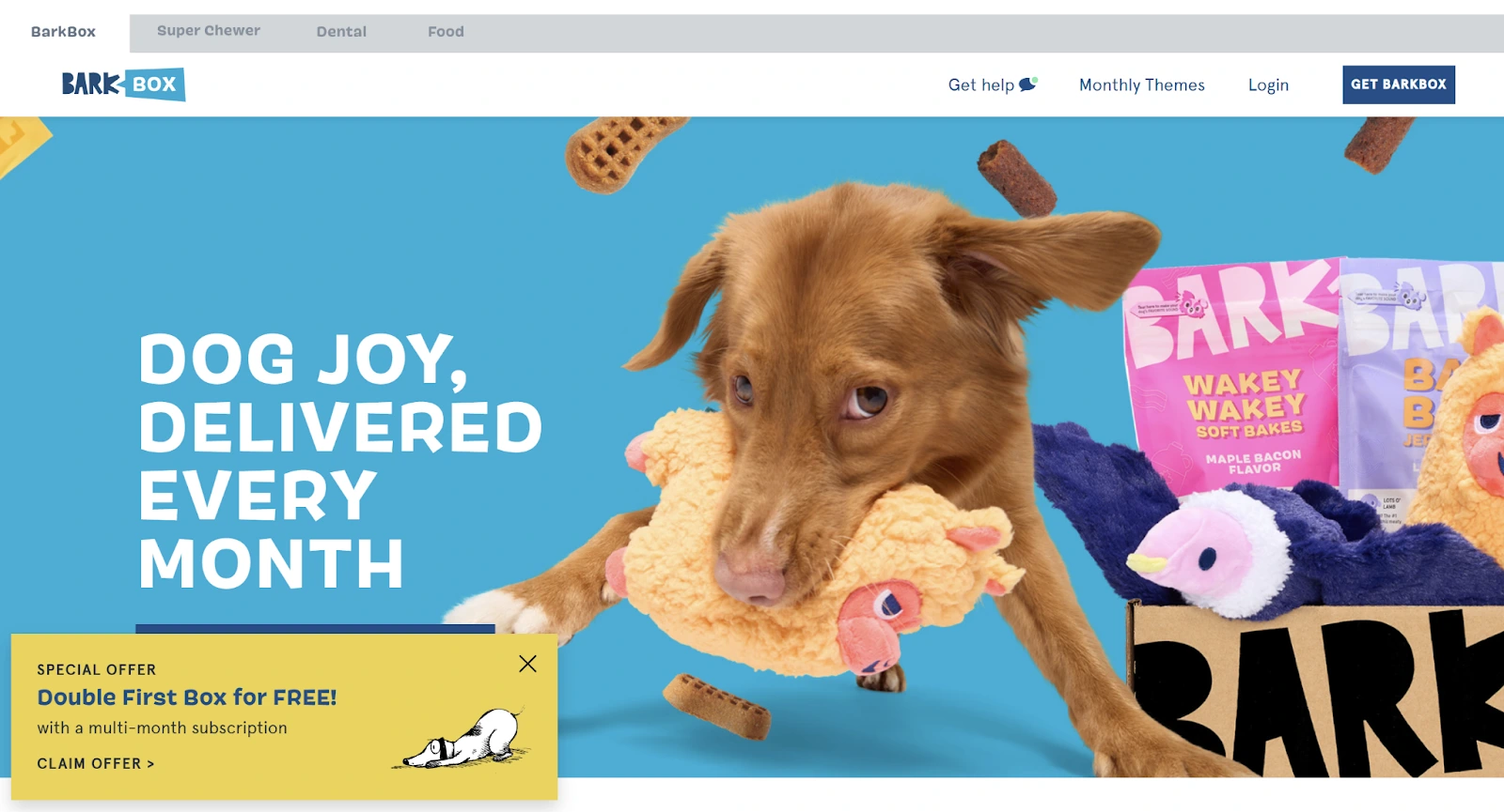
Real-world Example: BarkBox
The subheadline reinforces the value:
“Get BarkBox”
—short, clear, and action-oriented, prompting visitors to take the next step toward delighting their pup.
Special Offer pop-up CTA:
A floating pop-up on the homepage adds urgency:
“Special Offer: Double First Box for FREE with a multi-month subscription”
[Claim Offer]
This CTA is benefit-focused (“Double First Box for FREE”), action-driven, and stands out visually on the page. “Claim Offer” uses active language and creates a sense of immediacy, encouraging quick decision-making.
Why this works:
- Contrast: The “Claim Offer” button pops against the pop-up’s background.
- Placement: It’s floating and catches attention without being intrusive.
- Copywriting: Focused on the user’s benefit (free bonus box) and uses “Claim” to make it feel like an exclusive reward.
Key Insight: Attention-grabbing CTAs with clear, benefit-oriented language act as a catalyst for visitors to take the next step.
Once your CTAs are optimized, make sure your messaging keeps visitors engaged as they scroll further.
5. Benefit-Led, Skimmable Copywriting
Users don’t want to work to figure out what you offer. A Siegel+Gale survey revealed 70% of consumers prefer brands that communicate simply and directly.
- Lead with benefits, not features.
- Break up text with bullet points and short paragraphs.
- Use subheadings as signposts for busy scanners.
Feature: “Real-time monitoring tools”
Benefit: “Know instantly when your site is under threat, so you can sleep soundly at night.”
Match tone to audience: approachable for DTC brands, authoritative for B2B enterprises.
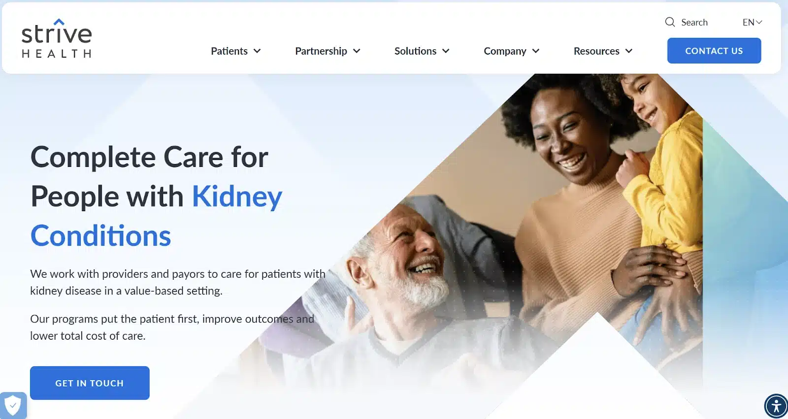
Real-world Example: StriveHealth
Benefit phrasing:
“Complete Care for People with Kidney Conditions”
This headline is clear and outcome-focused—it immediately communicates who the service is for (patients with kidney conditions) and what it provides (comprehensive care).
Benefit-led copy throughout the page:
- “Our programs put the patient first, improve outcomes, and lower total cost of care.”
- “Fewer hospitalizations, more home-based care, happier patients and partners.”
- “Our analytics platform provides our NP-led care team with predictive insights so they can slow patients’ kidney disease progression.”
These statements go beyond features like “predictive analytics” and speak directly to why it matters—better patient outcomes, less hospital time, and peace of mind for providers.
Skimmable structure highlights:
Subheadings as signposts
- “How We Work With Patients & Partners”
- “Our Solutions”
- “The Kidney Heroes™”
- “Resources & Tools for Patients”
Bullet-like metrics for quick scanning
- “49% Reduction in Hospitalizations”
- “36% Reduction in 30-day hospital readmissions”
- “52% Greater Home Modality Start Rate”
Short paragraphs and bold benefit phrases make it easy for busy visitors (patients, providers, or partners) to understand the value without digging.
Why this works:
- Leads with benefits, not jargon-heavy features (“better outcomes and lower costs” vs. just “predictive analytics”).
- Subheadings guide scanning for patients and health systems alike.
- Tone matches audience: authoritative and professional for B2B partners, but also warm and patient-focused.
Key Insight: Benefit-led, skimmable copywriting ensures key messages resonate even with users who only scan your page.
With clear and concise content in place, the final step is to remove distractions and guide users to focus on your primary conversion goals.
6. Distraction-Free, Focused Layout
On a landing page, every element should push visitors toward your primary goal. Anything else risks derailing them.
Streamline the experience:
- Hide or minimize top navigation bars.
- Remove external links that pull users away from the page.
- Use directional design elements—arrows, images, whitespace—to draw the eye toward CTAs.
ConversionXL found that eliminating header navigation on landing pages increased conversions by 100% in some tests.
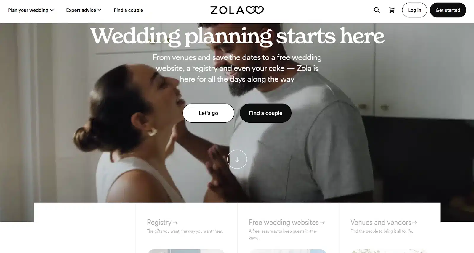
Real-world Example: Zola
Distraction-Free Layout Design:
Zola’s landing page is crafted to keep visitors focused on conversion:
- The top navigation bar disappears as you scroll down, creating a cleaner, distraction-free experience.
- Each section is designed to guide users toward a single action (e.g., “Build your registry”, “Find venues and vendors”).
-
Strategic use of imagery and whitespace draws the eye naturally to CTAs like “Get Started” and “Build Your Registry”.
Why this works:
- No sticky header reduces competing links and distractions as visitors engage with the page content.
- Subheads and bullets break up text for skimmability, catering to couples overwhelmed with wedding decisions.
- Directional visual cues—such as arrows and scrolling effects—guide users toward key conversion points.
Key Insight: A distraction-free layout channels user attention to critical actions, boosting engagement and conversions.
When combined with the other five elements, this creates a seamless, persuasive journey from landing to conversion.
Why This Matters
These six website design elements work best when integrated seamlessly. A clear value proposition, compelling visuals, and skimmable content build initial trust. Strategic CTAs and simplified forms make it easy for visitors to act, while a clean layout removes distractions and guides them smoothly toward conversion.
Together, these techniques turn passive browsers into engaged leads and give your business a real edge online. As UX expert Luke Wroblewski puts it, “Great design is invisible. It just quietly guides the user to their goal.”
Ready to Turn Your Website into a Lead-Generating Machine?
At Techna Digital Marketing, we build high-converting websites for growth-focused businesses. From sharp messaging to seamless UX, our team designs digital experiences that don’t just look good—they perform.

